Branding
As a photographer, it’s important that I create an identity for myself that sets me apart from other photographers. I love vintage things, and old-fashioned books, and all things like that, and I love to make my photographs fit into a creamy, vintage photography vibe. I also really love the color red, and I wanted to make sure that was a part of my branding.
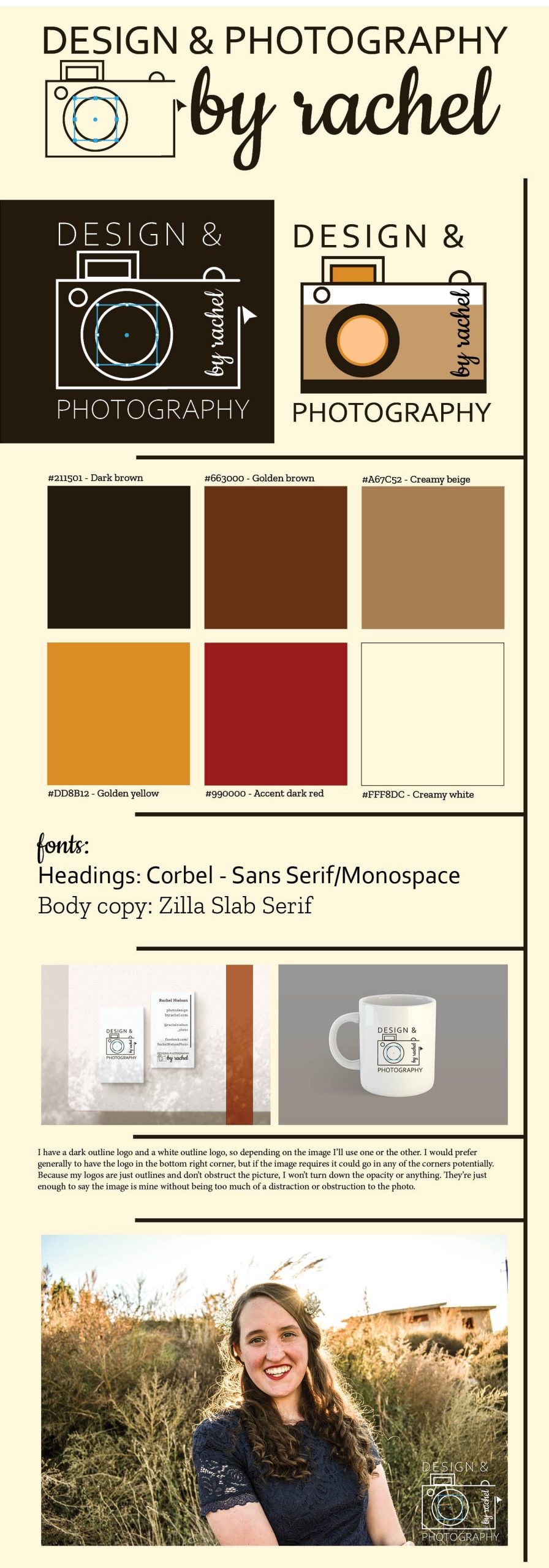
To begin, I made my logo similar to an old-timey camera to be in line with the vintage feel I was going for. I’ve included a couple mockups, but I’ve decided to mainly use the image on the left.
What does creamy vintage photography look like?
In creating this look for my brand, a huge thing I considered were colors. As I mentioned, I want a creamy feel, and I also wanted to incorporate the color red. So these are the colors I came up with.
Fonts are also super important. I used Corbel in my logo, and I use Zilla Slab Serif for the body copy of my marketing materials.
Design and Photography by Rachel – Your Favorite Vintage Photographer
With a logo, colors, fonts, and products, I’m finally all ready to go! If you’re looking for pictures that have a creamy vintage feel, reach out to me!
I love to do edits that create the creamy vintage photography that I’m going for, but if you’d like a little help on creating that feel I would recommend this video.
I hope to see you around!
Awesome work Rachel! Your color scheme fits you completely I think everything looks so cohesive and clean, great job! Keep up the good work my friend!